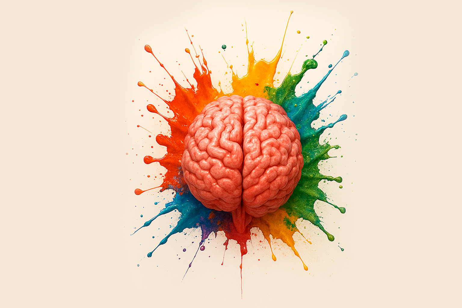
Color Psychology in Branding: What Your Palette Says About You
If you think color choices are just about looking good, you’re missing the point. Color is strategy. It’s psychology. It’s one of the first impressions your brand makes—and it speaks before you ever say a word.
So, what is your brand color palette really saying about you? Let’s break it down.
Why Color Matters
People make snap judgments. According to studies, up to 90% of first impressions are based on color alone. In branding, that means your colors aren’t just decoration—they’re doing the talking. They influence how your audience feels, what they expect from your company, and whether they trust you. This is especially important in saturated markets, where you're competing for attention in milliseconds.
What the Most Common Brand Colors Communicate
- 🔵 Blue – Trust, stability, intelligence
Popular with banks, tech companies, and healthcare. Blue says, “We’re reliable. We’re not going anywhere.” If your business is based on long-term relationships or sensitive transactions, blue may be your best friend. - 🔴 Red – Power, passion, urgency
Red grabs attention—fast. It’s bold and emotional. It creates a sense of movement, intensity, and appetite (that’s why so many fast food chains use it). Just don’t overdo it unless you want to feel like a fire alarm. - 🟡 Yellow – Optimism, warmth, clarity
Yellow can bring energy and friendliness to your brand. But too much? It can look cheap or overwhelming. It works best as an accent color—a dose of sunshine, not the whole desert. - ⚫ Black – Sophistication, control, modernity
Black is sleek. Premium. Confident. It tells people you know your value and aren’t trying too hard to impress. If you’re building a luxury or high-end brand, black isn’t just safe—it’s often smart. - 🟢 Green – Growth, balance, health
Green has range. It can say organic and earthy, or wealthy and successful, depending on the shade. Lighter greens lean natural. Darker greens signal affluence and stability. - 🟣 Purple – Creativity, luxury, individuality
Used right, purple can feel premium and imaginative. Used wrong, it can feel disconnected or overly niche. It’s not for every brand—but for the right one, it’s unforgettable. - 🟠 Orange – Energy, friendliness, confidence
Orange sits between red’s urgency and yellow’s optimism. It’s approachable, enthusiastic, and hard to ignore. Great for brands that want to show personality and momentum.
Color ≠ Identity — But It’s a Start
Color alone won’t fix a weak brand. But if you’re building a great brand, it can do a lot of heavy lifting. The key is alignment. Your colors should match your tone, your voice, your values, and—most importantly—your audience’s expectations. A modern construction company using hot pink? Might stand out. But will it convert the type of client they want? Probably not.
What Your Color Palette Might Be Saying (That You Didn’t Realize)
Here’s where most brands get it wrong: they pick colors because they like them—not because they work. That’s a branding mistake. Your personal taste is not the same as strategic design. If your palette says “cheap” when you’re aiming for “premium,” your branding is working against you. If your colors say “fun and friendly” but your sales process is stiff and corporate, there’s a disconnect. Your color palette should reflect your brand’s positioning—not just its personality.
Final Word: Own Your Intent
There’s no one-size-fits-all color scheme. A bold, rebellious brand should not look like a bank. A trusted financial advisor shouldn’t look like a skatewear brand. The point isn’t to use colors a certain way—it’s to use them on purpose.
When we develop brand identities, color is never random. It’s backed by strategy, psychology, and context. If your color palette doesn’t align with how you want to be perceived, it’s time to rethink what message you’re actually sending.
Need a brand palette that actually works for you? We help businesses build brands that look the part—and back it up.